
Start with where the label will live
Before you look at artwork or colours, decide where the label will sit and how it will be used. A label on a water bottle, chemical drum, bakery tub or retail box all need different materials and adhesives. In Rustenburg the conditions can change fast, from hot vehicle loads to chilly storerooms and humid weekends, so the label must match the job not just the look.
Think about the surface first. Smooth plastic, glass, powder coated metal and textured cartons all grip a label differently. If the container is curved, squeezed often or handled with oily hands, you need stock and glue that will stay put. For mine stores, workshops and school supplies, clear identification is often more important than decoration, so legibility should lead every choice.
- Check the surface: smooth, rough, curved or flexible
- Check the environment: indoor, outdoor, cold room or dusty site
- Check handling: hand applied, machine applied or repeated touching
- Check duration: short term promotion or long term product use
Choose the right label stock for the job
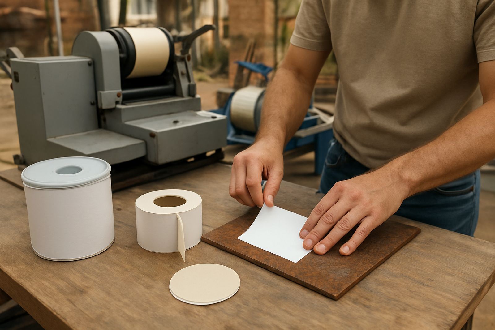
Label stock is the base material. Paper labels cost less and work well for dry indoor products, cartons and short run packaging. Synthetic stock is tougher and better for moisture, oils and frequent handling. For products that sit in sunlight or near heat, synthetic material usually gives better service life. If you are packing goods for mines or field use, this is often the safer choice.
We also look at the face finish. A matt finish is good for handwriting, batch codes and a clean practical look. Gloss can improve colour pop on retail packs, while clear labels suit bottles and jars where you want the pack itself to show through. The wrong finish can make a label hard to read under store lights or on a busy shelf, so it is worth matching the finish to the purpose.
- Paper stock: lower cost, best for dry indoor use
- Synthetic stock: better for moisture, rough handling and longer life
- Clear stock: useful on glass, bottles and premium packs
- Matt finish: good for writing, notes and batch marking
- Gloss finish: brightens colour and works well for retail display
Match the adhesive to the container
The adhesive is just as important as the label itself. A good print with a weak glue will lift at the corners, especially on cold or dusty containers. Removable adhesive is suitable for temporary promotions, price changes and event use. Permanent adhesive is better for product identification, compliance labels and stock that will be stored or transported. For cold chain items or chilled drinks, ask for adhesive that can still bond on colder surfaces.
If your container has a textured finish or slight curve, we may recommend a heavier tack or a material that can flex a bit. On powders, oils and dusty drums, surface prep matters too. Wiping the area clean and dry before application makes a big difference. Even a good label can fail if it is applied over dust, condensation or loose powder, so the fitting step matters more than many buyers think.
- Temporary use: removable adhesive
- Long term use: permanent adhesive
- Chilled or damp packs: cold safe adhesive
- Textured surfaces: stronger tack may be needed
Plan the artwork so it prints cleanly
Good labels start with clear artwork. Keep text large enough to read at arm’s length, especially for stock rooms, school supplies and industrial packs. Barcodes, ingredient panels, warning blocks and batch areas should not be squeezed into tiny spaces. If the label is going onto a small bottle or sachet, it is better to simplify the layout than force too much content onto one face.
Use strong contrast between text and background. Black on white is still one of the easiest combinations to read, but other colour pairs can work if there is enough difference. Avoid placing important text over busy images. If you need variable information such as serial numbers, dates or product codes, leave space for that during artwork setup so the final print stays neat. Mpho often checks for this before printing because a label that looks fine on screen can become messy once cut to size.
- Keep copy short and legible
- Leave room for barcodes, dates and batch codes
- Use clear contrast between text and background
- Avoid crowding the label edge
Finish choices for retail, compliance and hard wear use
Finish affects both appearance and durability. Lamination adds a protective layer that helps against scuffs, damp handling and light surface wear. It is useful for labels that may be rubbed in transit or stacked in crates. For premium packs, a neat gloss laminate can help the product stand out. For a more practical look, matt or satin lamination keeps reflections down and makes text easier to read under bright lights.
For labels that need a professional finish on products, packs and containers, think about trimming and edge quality too. Clean cuts reduce lifting and help the label sit flatter. If you are branding boxes for a school supply run or items going out on site, the label should still look straight after delivery and setup. That is especially important when packs are handled by many people before they reach the end user.
- Lamination helps with scuff resistance and handling
- Gloss gives a brighter retail look
- Matt reduces glare and keeps text readable
- Clean cutting helps labels sit flat
A simple buying checklist for better results
When you are ready to place an order, work through a short checklist. First confirm the container size and the space available for the label. Then confirm whether the label must survive water, sunlight, refrigeration, oil or repeated touching. After that, decide if the label is purely informative or if it must also sell the product. This saves time and cuts waste on the first run.
For Rustenburg businesses, schools and mines, timing can matter too. If products are going out for a tender, event or monthly supply cycle, build in enough time for artwork checks and printing. In busy periods, small changes like one missing code or a shifted logo can hold up the whole run. A clear brief gives better value and fewer reprints.
- Measure the container or pack area first
- Decide on short term or long term use
- Confirm indoor, outdoor, cold or wet conditions
- Choose stock, adhesive and finish together
- Allow time for artwork approval and print setup
Crystal Clear Printing supports label jobs from the Rustenburg CBD base and supplies clients across Tlhabane, Phokeng, Kroondal, Boshoek, Marikana, Mooinooi and Mogwase. If you need help matching the right label to the product, pack or container, send the details through the enquiry form on our contact page and include the size, use and quantity.