Why logo position matters on work uniforms
Uniform branding has to do more than look tidy. It should help customers spot your team quickly, keep names and logos readable at a distance, and still hold up after daily wear, washing and long shifts in the Rustenburg heat. A logo placed too low, too large or too close to seams can look crowded and wear out faster.
For mine teams, school support staff, delivery crews and workshop staff across Bojanala, the right placement also helps with identification. A clean chest logo on a shirt or jacket is usually easy to read when someone is standing face to face, while a back logo helps when a team member is moving around a site or building. The aim is simple: let people know who you are without making the garment feel heavy or overdone.
We normally look at the garment first, then the job, then the logo size. That order saves money and gives better results. A logo that works on a cotton golf shirt may not work the same way on a moisture-wicking top or a thick overall. The fabric, stitch count and print method all matter.
Chest placement for everyday visibility
The chest is the most common spot for uniform logos because it is easy to see, easy to read and works well for both embroidery and print. Left chest placement is often the neatest option for office staff, drivers, supervisors and front-facing teams. It keeps the brand close to the eye line without taking over the whole garment.
For a standard shirt or golf shirt, a chest logo usually sits between 80 mm and 100 mm wide. If the artwork has small wording, keeping it compact makes a big difference. A logo that is too wide can bend with the body and lose clarity. On hi-vis wear or jackets, we may shift the logo slightly higher or lower depending on seams, pockets and reflective tape.
Chest branding works well when you want a professional look that still feels practical. It is also one of the best choices for garments that are washed often. The logo is protected better than a large back print, and it does not rub as much against chair backs, safety belts or bags.
- Best for shirts, golf shirts, jackets and light overalls
- Good for names, departments and small business logos
- Works well with embroidery for a polished finish
- Can be paired with sleeve branding for extra detail
Sleeve branding for teams on the move
Sleeve placement is useful when you want more brand presence without crowding the chest. It is a smart option for service teams, site crews and staff who often face sideways to customers. A sleeve mark is also handy when the chest area is already busy with a name badge, reflective strip or pocket.
Small sleeve logos are usually best. They can include a logo, a department name or a short line of text. On workwear, the outer sleeve is often the safest place, especially for people who use tools or work around equipment. A logo on the forearm area may wear faster, so we generally keep it higher up the sleeve.
For colder months in Rustenburg, sleeve branding on jackets and fleece tops works well because the logo stays visible when the front zip is closed. It also gives your team a consistent look across different garment types. If you want the branding to stay readable, avoid squeezing too much detail into a small space.
- Useful for site crews, drivers, technicians and event staff
- Helps with brand visibility on layered winter wear
- Good place for a smaller logo or a short slogan
- Should be positioned to avoid seam pull and cuff wear
Back logos for larger visibility at sites and events
The back is the strongest place for visibility from a distance. It is often the best choice for larger crews, events, traffic control, delivery teams and field work. When people are walking away from a client, a vehicle or a work area, the back panel gives the brand a clear reading space.
Back branding can be printed or embroidered, depending on the garment and the look you want. On jackets, a medium to large back logo can be very effective. On lighter shirts, the logo size needs to be balanced so the fabric does not pull or sag. A good back layout usually leaves breathing room around the artwork, especially if the garment has panel seams or vents.
For companies working around mines or municipal sites, back branding can also help with security and identification. A clean, readable name on the back helps supervisors and visitors know who they are dealing with. It is a practical choice when teams must be seen quickly and clearly.
How to choose the right placement for each garment type
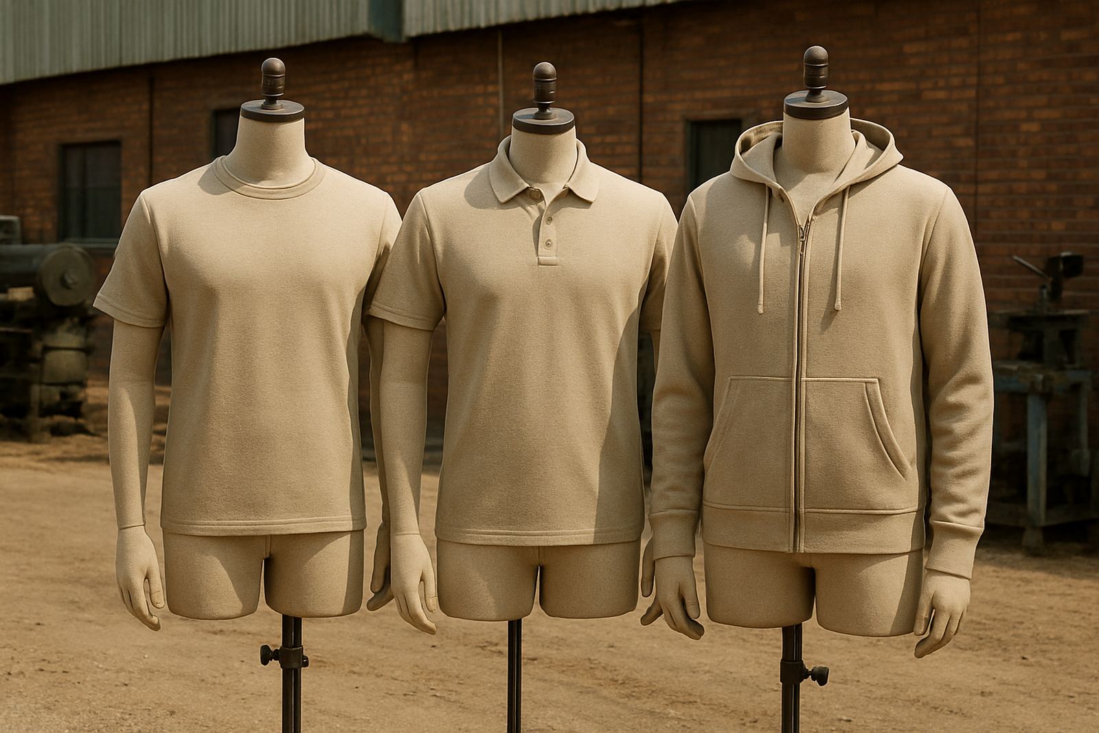
Not every uniform item should carry the same logo in the same spot. The garment type often decides the placement. A golf shirt can take a chest logo neatly, while an overall may need a sleeve mark plus a back logo. A cap may only need a small front mark, while a jacket can carry multiple positions if the design stays balanced.
Think about how the garment is worn during a normal shift. If a worker bends often, a logo placed too low may fold into the waistline. If the garment has pockets, zips or reflective tape, the logo needs to sit clear of those features. That is why we normally check size, placement and finish together before production starts.
In Rustenburg, where teams move between indoor offices, outdoor yards and dusty site conditions, practical placement matters more than fancy layouts. A logo that looks good in a mock-up but catches on a seam or disappears under a safety vest is not doing its job.
- Shirts: chest is usually the clearest choice
- Overalls: sleeve plus back often works best
- Jackets: chest and back can be combined neatly
- Caps and beanies: keep artwork small and bold
Choosing embroidery or print for your logo position
The placement and the branding method should match. Embroidery is a strong choice for chest logos on shirts, jackets and heavy garments because it has a neat raised finish and handles frequent washing well. Print is often better for larger back logos, detailed artwork or garments where fine lettering needs to stay sharp.
For uniforms used in the Rustenburg CBD, Tlhabane, Phokeng and the surrounding supply routes, we often suggest embroidery for staff who need a smart everyday look and print for event wear, safety campaigns or promotional clothing. Some garments can take both methods, such as a small embroidered chest logo with a printed back mark.
We also check thread colours, fabric weight and how the garment behaves after washing. Some fabrics stretch more than others, and some lighter materials can pucker if the stitching is too dense. That is why good logo placement is never only about looks, it is about the garment lasting as intended.
A practical Rustenburg example for a mixed team
Picture a Bojanala contractor with office staff, drivers and site workers. The office shirts can carry a left chest logo for a clean client-facing look. The drivers can use the same chest logo plus a small sleeve mark for quick recognition. The site team can wear overalls with a chest name, a sleeve logo and a back brand that stays visible from a distance. That gives one company a consistent identity across different work roles.
For schools, the same logic applies. Admin staff may need neat chest branding on shirts, while grounds teams and maintenance staff may benefit from a larger back mark. For promotional events in Rustenburg or Marikana, gazebos, flags and staff shirts can all carry the same visual language so the whole stand feels organised. The layout should suit the people wearing it, not just the logo file.
At Crystal Clear Printing, we help clients choose placements that fit the garment, the worksite and the budget. With the right position from the start, your uniforms look better and last longer, which saves rework later on.