Why garment colour changes the whole stitch story
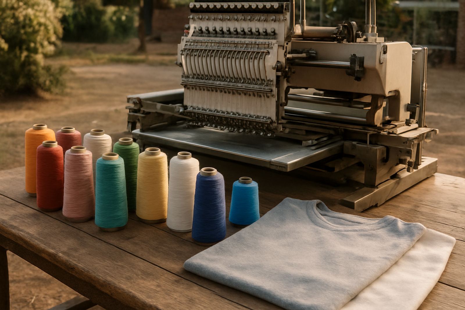
Embroidery is not just about the logo file, it is about how thread sits on the cloth. On dark shirts, light thread usually pops hard, while on pale garments the same colour can look stronger than expected. That is why a logo that looks neat on white cotton may disappear on navy, charcoal or bottle green if the thread is chosen poorly.
In Rustenburg, many orders go onto uniforms worn in mines, workshops, schools and site offices. Those garments get dust, sun and repeated washing, so visibility matters from day one. A thread colour should work with the garment shade, the logo detail and the job site. Even a small colour shift can change the whole read of the design.
The best thread colour depends on the cloth underneath
There is no single thread colour that suits every garment. The same company logo may need different thread choices on a white golf shirt, a black conti shirt and a hi vis vest. That is normal. The stitch must not sink into the fabric or clash so badly that the logo feels noisy.
Good thread planning starts with the garment colour family. Warm tones, cool tones and dark shades all behave differently under thread. A red logo may read cleanly on grey, yet get lost on maroon. A silver thread can look neat on navy, but it may be too soft on black if the design needs stronger impact.
- White and very light garments suit darker thread for clear contrast.
- Black, navy and charcoal garments often need bright or pale thread to stand out.
- Mid tones like grey, khaki and royal blue need careful testing because contrast can go either way.
- Busy prints or textured fabric may need a simpler logo version so the stitches stay readable.
When contrast helps and when it hurts
High contrast sounds like the obvious choice, but not every logo benefits from it. Strong contrast can make lettering crisp, yet it can also expose tiny digitising faults and very small details. If a logo has thin lines or tiny words, a bright thread on a dark shirt may make every edge look harsher than intended.
Lower contrast can work well when the garment is already loud or when a neat corporate look is more important than a bold shout. For example, a tone-on-tone logo on a quality golf shirt can feel smart and quiet. But for safety wear, events or promotional gifts, more contrast is usually better so the branding remains visible from a distance.
- Use strong contrast for safety vests, event wear and site identification.
- Use softer contrast for executive shirts, hospitality uniforms and premium gifts.
- Test small lettering before approving final production, especially on textured fleece or caps.
How local conditions in Bojanala affect thread choice
Rustenburg weather can be hot, dusty and hard on garments. On outdoor uniforms and caps, colour choice should stay readable after sun exposure and repeated cleaning. If the garment will go out to the mines or field teams, the logo has to survive bright sunlight and dust without turning dull. Coastal humidity is not the issue here, but sweat, dust and strong sun are.
For schools and businesses in Tlhabane, Phokeng, Kroondal, Boshoek, Marikana, Mooinooi and Mogwase, the goal is often the same: keep the branding clear from a few steps away. That means choosing thread that holds its colour and does not disappear into the garment after a few washes. A good choice today can save a lot of rework later, which matters when uniforms are issued in batches.
Thread choices for different garment types
Different garments need different levels of stitch impact. A thick hoodie, a fine pique golf shirt and a caps front panel each show thread differently. The same thread shade can look bold on a hoodie and faint on a soft knit shirt, so the garment type should always guide the final call.
For corporate shirts, clean contrast and tidy lettering usually matter most. For workwear, durability and visibility come first. For hats and beanies, the stitch count and the angle of the surface can change how the colour reads. A small logo may need a thicker outline or a slight colour adjustment so it does not vanish into seams or folds.
- Golf shirts: choose colours that keep lettering readable on textured knit fabric.
- Work jackets: use thread that stays visible on heavy cloth and stands up to grime.
- Caps and beanies: allow for curved surfaces that can make dark thread look even darker.
- Promotional wear: keep the logo simple enough that the thread colour still looks tidy at scale.
A Rustenburg example from order to finish
A mining contractor in Rustenburg might order navy shirts for supervisors and khaki shirts for ground teams. The logo cannot be treated the same on both. On navy, a pale thread can carry the logo with good visibility. On khaki, a deeper thread may be needed so the mark does not fade into the fabric. The embroidery coordinator checks the garment shade, the stitch density and the size of the logo before production starts.
That kind of practical check avoids wasted stock and makes the final result easier to wear. When the same brand is going onto shirts, jackets and caps in one order, the team may need several thread options to keep the look consistent. It is not about making the thread the star. It is about making sure the logo is seen, recognised and worn with confidence.
What to send with your order so the thread choice is right
To get the colour choice right, it helps to send clear details at enquiry stage. The garment colour, fabric type, logo size and intended use all matter. If the items are for a school, a site team or a promotional launch, say so early. The more context you give, the easier it is to choose a thread that suits the job.
From the Rustenburg CBD, our team supports clients across Bojanala with embroidery, garment branding and setup. The team handles artwork setup, embroidery digitising, garment embroidery and delivery, so the thread decision can be tied to the whole production plan. That way the logo does not just look good on screen, it reads well on the actual shirt too.
- State the garment colour and fabric type.
- Share where the items will be worn, such as office, site or school.
- Ask for a sample view if the logo has fine lettering or multiple colours.