
A guesthouse brief that needed one clear look
The client was a local guesthouse in Rustenburg town, serving overnight guests, contractors and families passing through the area. They needed one sign package that would work at the street front, at the rooms and in the reception area, without looking pieced together over time. The main brief was practical: the entrance had to stand out from the road, the room labels had to be legible after dark, and the reception items had to match the guesthouse name and finish neatly.
Right from briefing, the guesthouse job had a few practical limits to work around. The property had enough visitor traffic to justify proper branding, but the surfaces were varied and some areas were exposed to sun, dust and regular cleaning. We also had to keep the look calm enough for a guesthouse setting, not too busy, and make sure the sign sizes suited the available wall and gate space. In a town like Rustenburg, where many guesthouses carry mining visitors and short stay bookings, first impression matters from the moment a driver slows down at the gate.
What we supplied for the entrance and rooms
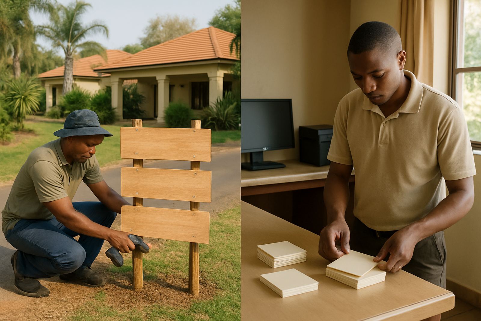
We supplied the entrance sign as the main focal point, then carried the same visual language through to the room labels and reception print items. The entrance piece was made for outdoor visibility, with bold lettering and clean contrast so visitors could read it quickly from the road and from a moving vehicle. The room labels were produced in a format that was easy to place, easy to clean and consistent across all rooms, while the reception items carried the same wording and styling for a tidy front-of-house finish.
- Entrance sign for road-facing identification
- Room labels for doors and internal wayfinding
- Reception print items for check-in and guest information
- Artwork setup and layout alignment across all items
- Print finishing suited to daily handling and cleaning
We kept the colour treatment consistent so the guesthouse name stayed recognisable at every point. The job was not about over-designing it, it was about getting the same message across gate, corridor and counter. That kind of consistency helps guests feel they have arrived at the right place straight away.
Materials, sizing and finish choices that suited the site
For the entrance sign, we used a durable outdoor signboard with print and finishing selected for Rustenburg weather conditions. The area gets hard sun, dust and the occasional heavy rain, so the finish needed to hold up without fading quickly. The room labels were made smaller and easier to maintain, with clean edges and a finish that would not peel from repeated wiping. At reception, the print items were prepared for regular use and placed where guests would see them immediately on arrival.
The practical detail was in the measurements and placement. The main sign was scaled to fit the wall and street visibility, while the room labels were sized for door placement without blocking handles or other hardware. Reception prints were kept at a useful reading distance, not too large, not too small. We also made sure the overall package matched the guesthouse setting, which means it had to look professional without shouting at people. Thats usually the balance that works best for hospitality spaces.
- Outdoor-facing sign with weather-aware material choice
- Compact room labels for clear internal navigation
- Reception print items sized for daily guest use
- Clean cut edges and tidy application finish
- Colour matching across all printed pieces
Production and delivery timeline in weeks
The full project moved through artwork, approval, production and delivery over a short lead time of two weeks. Week one covered layout work, checking wording, adjusting sizes and confirming how each item would sit on site. Once the client approved the final artwork, we moved into production and finishing. Week two covered final checks, packing and delivery to the guesthouse for installation and placement.
Because the items were supplied together, the client did not have to coordinate with multiple suppliers or wait on separate deliveries. That saved time and reduced the chance of a mismatch between the sign at the gate and the print pieces inside. For a guesthouse that takes bookings week by week, a tight turnaround matters because the property still needs to operate while work is going on. The result was a neat handover and a site that could keep receiving guests with very little interruption.
Why the finished result worked for the property
The strongest result was clarity. Guests could identify the property from the entrance, then find their way to the correct room and reception counter without asking for help every time. That matters for hospitality because it reduces confusion at check-in and gives the place a more organised feel. The guesthouse also gained a more consistent look, which is important when signage, labels and printed items all form part of the same visitor experience.
It also helped that the finished pieces were practical to maintain. Guesthouses need items that can handle cleaning, sunlight and regular handling. The materials and finish we used were chosen with that in mind, so the client would not be stuck replacing things too soon. A sign package should do more than look good on day one, it should keep doing the job through the busy season and over time. In this case, the main issue was solved right away, and the property now has a clearer identity at the street edge and inside the building.
What we would repeat on the next guesthouse signage job
If we were doing a similar guesthouse project again, we would follow the same approach: start with the entrance sign, then build the room labels and reception items around one shared artwork system. That keeps the job efficient and helps avoid small differences in colour, wording or scale. We would also keep a close eye on wall sizes, line of sight from the road and how the indoor items sit within the guest area.
For guesthouses in Rustenburg and surrounding towns, that method works well because the sites are often busy, practical and lightly built around existing finishes. The best outcome comes from signage that fits the property rather than fighting it. One or two correct decisions early on can save a lot of rework later, especially when the building is occupied and there is limited time to stop and start.
- Confirm all sizes on site before production
- Keep the same type style and colour family across every item
- Choose finishes that suit sun, dust and frequent cleaning
- Plan installation around guest movement and access
Key facts
| Project | Hedena Guesthouse Signs |
|---|---|
| Client type | Guesthouse in Rustenburg |
| Items supplied | Entrance sign, room labels, reception print items |
| Timeline | 2 weeks from artwork to delivery |
| Key focus | Visibility, wayfinding and a consistent guesthouse look |
| Service areas | Rustenburg CBD and surrounding Bojanala locations |