
A Practical PPE Branding Brief For A Boitekong Field Team
The client was a local service team working in Boitekong, Rustenburg, with staff moving between site checks, open areas and yard work. They needed PPE branding that made the team easy to identify at a glance, especially where visitors, subcontractors and mine-linked work sites often require quick visual control.
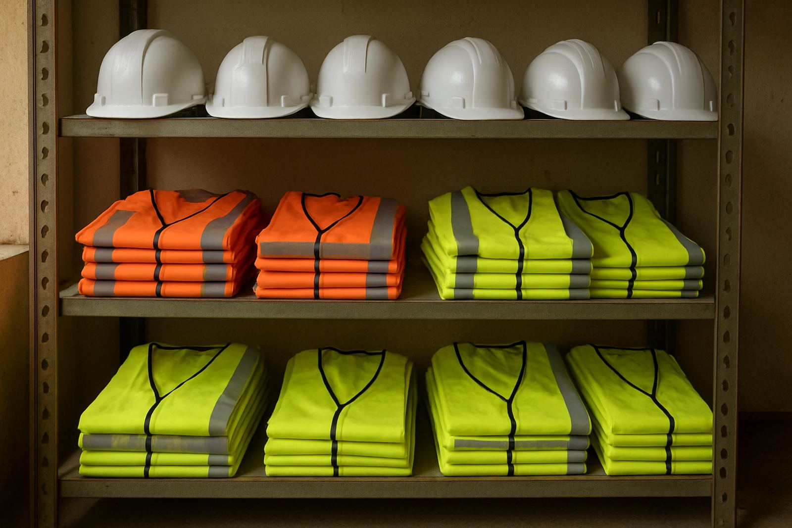
The brief came down to two items: reflective vests for field visibility and hard hat stickers for clear team marking. The gear had to look tidy, stay readable in bright sunlight, and keep working after repeated use in dust, heat and changing weather. We also had to keep the branding simple enough to work on small surfaces, because helmet space is limited and not every logo reproduces well at that size.
- Client type: field service team
- Town: Boitekong, Rustenburg
- Items: reflective vests and hard hat stickers
- Main need: visibility and team identification
What the Boitekong site conditions meant for branding
Boitekong work can be demanding on PPE, with long days, rough handling and the kind of dust that settles into almost everything. The client wanted items that would still look presentable after being packed into bakkies, worn on site, and cleaned often. We also had to factor in load-shedding, because anything that depends on a tight production slot can be delayed if the schedule is not planned properly.
The reflective vests needed to stay light enough for daytime wear but visible enough for early starts and lower-light conditions. For the hard hats, the stickers needed to fit curved surfaces without lifting at the edges. That meant careful sizing, proper cut lines and a clean adhesive finish. We used material and layout choices that suited rough field use, not just a neat presentation on day one.
- Heat and UV exposure were a concern on both items
- Helmet curvature required smaller, accurate stickers
- The vest branding had to remain visible from a distance
How We Prepared The Artwork And Production
Mpho handled the artwork setup so the logos and text could be scaled correctly for both vest panels and helmet stickers. For the vests we kept the layout bold and simple, with high contrast so the branding would still read from across a yard or roadside area. The helmet stickers were trimmed to suit the shell shape and placed so they would not interfere with safety markings already on the hat.
Once artwork was approved, Johan supervised production and finishing. The reflective vest branding was prepared for clean placement, while the stickers were cut with consistent edges for easier application. We checked each set before dispatch, because a small sizing issue on a helmet sticker can become a real annoyance once it starts peeling at the corner.
- Artwork setup for small-format and garment surfaces
- High-contrast layout for better visibility
- Cut and finish checks before issue to the client
The Supply Mix We Delivered
We supplied a compact PPE branding package that matched the client’s daily use. The reflective vests were chosen for visibility and ease of movement, while the hard hat stickers were made for practical, repeated use on site. No extra clutter, just the pieces needed for the team to look organised and remain identifiable.
The final supply was delivered with enough consistency across items to keep the whole team looking uniform. That matters on mixed sites where supervisors, contractors and visitors need to know who belongs where. In our experience, good PPE branding is not only about appearance, it also helps with basic site control and avoids confusion at entry points or during team movement.
- Reflective vests for field visibility
- Hard hat stickers for individual PPE identification
- Uniform look across the team
- Suitable for daily site handling
Two-Week Turnaround From Brief To Delivery
The project ran over 2 weeks from brief to delivery. The first stage covered confirming the sizes, placement and artwork details. The second stage was production, inspection and packing for handover. Because the client needed the items for field use rather than a long campaign, speed mattered but accuracy mattered more.
We kept the process tight and practical. The client received a clear update on what would be produced, and the handover happened once every piece had passed the final check. That approach helped avoid rework and kept the project on schedule, which is especially useful when teams are already booked for work in surrounding Bojanala areas. It also meant the client could issue the PPE sooner and put the branding into use without delay.
What The Client Got Out Of It
The immediate result was a more professional looking field team that was easier to identify on site. The reflective vests improved visibility, while the hard hat stickers gave each helmet a consistent team mark. For a client working in and around Boitekong, that kind of clear identification helps with day-to-day control and makes the crew look organised from the first meeting to the final handover.
If we were doing the same job again, we would follow the same formula: keep the artwork simple, test the sizing early, and choose materials that suit heat, dust and repeated handling. That is the part we would repeat every time, because it gives the best balance between appearance and practical use. It also keeps the process neat when a site has changing staff numbers or mixed PPE stock.
- Clearer team identification on site
- Improved visibility for field staff
- Uniform PPE presentation across the crew
- Simple process that can be repeated for future batches
Key facts
| Project | Boitekong PPE branding for a field team |
|---|---|
| Items supplied | Reflective vests and hard hat stickers |
| Town | Boitekong, Rustenburg |
| Turnaround | 2 weeks |
| Work type | Artwork setup, PPE branding and delivery |
| Use conditions | Dust, sunlight, heat and daily site handling |